Why does my product look different in every photo? How do I know which colors trigger which emotions in my customers? How can I stretch two logo colors into a fully accessible palette?
These are well-known problems that nearly all e‑commerce sellers face. And solving them can be a pain since they’re all related to color theory, an abstract but important aspect of product visuals that can:
Signal who your product or brand is meant for
Reduce hesitation and returns by managing shoppers’ expectations
Strengthen your brand identity over time
So, how do you apply color wheel theory to product images? In this guide, you'll learn five major use cases, with color theory examples for each. You'll also discover ways to automate the process with Photoroom and some best practices for using colors on product images.
Table of contents
5 ways to apply color theory to product photos
Lead with your product colors
Use contrast to guide attention
Choose a background that supports your brand
Balance hue, saturation, and brightness for clarity
Create visual cohesion between different product shots
Color theory blends science and art to explore how colors relate to one another and how we interpret them. It includes principles like the color wheel, color theory psychology, color palette, color types, color harmony, color models, contrast, hue, saturation, and lightness (HSL).
Let’s look at ways you can infuse them into your product visuals.
1. Lead with your product colors
Color theory principle: Harmony (including color wheel, color types, and color palette)
Your product already holds the answer to your visual direction. Instead of forcing a predetermined color scheme, build your photo around the product’s existing colors. When your product leads the palette, every other element, like props, background, and lighting, works in service of it. This results in a compelling image that can persuade customers to buy.
Here’s how to do it:
Identify the dominant color (or color family) of your product.
Choose 1–2 supporting colors using the color wheel:
Analogous colors: These sit next to each other and naturally pair well together (like blue, blue-green, and green).
Complementary colors: These are opposite each other on the color wheel and create bold contrast (like blue and orange).
Triadic colors: These are three colors spaced evenly around the color wheel (like red, yellow, and blue).
Monochromatic colors: These are different shades and tints of the same color (like light blue, medium blue, dark blue).
Split-complementary colors: These combine one main color and two colors that sit next to its opposite on the wheel (like purple with green and yellow-orange). They give contrast like complementary colors, but feel a bit softer and easier to work with.
Neutral pairings: These use your main color with white, gray, beige, or black.
If your product comes in different colors, pick distinct supporting colors for each product or use a neutral pairing.

Tools that simplify the process:
Use Coolors, Paletton, or the color palette library in Photoroom’s brand kit feature to find color combinations.
Use the AI Backgrounds tool to automatically apply colors that support your product.
If you’re photographing a red lipstick, for example, you can:
Choose a neutral (white, gray) or complementary green/teal background to keep the focus on the red.
Use warm-toned props (like blush pink or coral) to make it look pleasing.
Avoid shades of colors (like electric blue) that either become the center of attention or reduce the visual appeal of the lipstick.
That’s exactly what I did for this lipstick using the AI Backgrounds tool in Photoroom. I entered some simple prompts to get the complementary green and scene with matching prop colors. You can see how the electric-blue color intensifies the scene, almost hiding the details of the lipstick.

2. Use contrast to guide attention
Color theory principle: Contrast
Our eyes tend to notice things that stand out sharply from their surroundings, and contrast is the reason for that. It involves putting your product next to things that look different to make it more visible and attract a potential customer to your store.
Try one of these contrast types on your product image
Hue contrast: Place your product near colors that sit opposite or far apart on the color wheel (e.g., blue vs. orange, red vs. green) to differentiate it instantly.
Saturation contrast: Place a vivid product against a toned-down setting (like beige or dusty pink) to amplify the intensity and liveliness of the product’s color. A study shows that consumers are more likely to buy a strong product (like detergent) if the packaging or background has a high saturation contrast.
Brightness contrast: Combine light and dark elements, like a bright product on a dark background or vice versa, to highlight the product’s shape and form.
Texture contrast: Position shiny items against matte, rough, or patterned surfaces to help customers imagine how the product feels.
Lighting contrast: Use shadows or lighting that hits your product from one side to show depth and product details.
Here are the best AI photo editing tools for adding contrast to product photos:
Start with Photoroom’s AI background remover to isolate the product. You’ll need this too if you’re creating visuals for ads.
Use the background color tool, AI Backgrounds tool, and background library to experiment with hue, saturation, brightness, and texture contrasts. You can use the simple black and white background to apply hue contrast.
Quickly add realistic shadows using the AI Shadows tool for depth.
Use the Adjust feature in Photoroom’s editor to tweak the contrast of your full image.
For example, I used the Background Remover to erase the background of my mesh cap. I then prompted the AI Backgrounds tool to add the different contrasts, based on what is suitable for this product. It did a great job, providing photo options for various platforms.
You can tweak and use my exact prompts if you want the same contrast styles or directly duplicate my first three visuals in Photoroom (hue contrast visual, saturation contrast, brightness contrast).
If you don’t have any prompts, the AI Backgrounds tool will still auto-create settings and visual elements that work best for your photo.


3. Choose a background that supports your brand
Color theory principle: Harmony and color psychology
Backgrounds occupy nearly 100% of product photos. So, choose colors and scenes that pair well with your product’s color and support your brand’s style, message, product type, and sales channel.
Use a setting that speaks to your audience and product type. A wooden utensil, for instance, belongs on a sun-warmed stone or textured kitchen wall. These backdrops suggest sustainability and a slower way of living. But a stainless steel utensil fits better on plain surfaces (like grey marble counters), especially if you want to convey a sense of modernity and getting things done without fuss.
Adapt to platform norms. White backgrounds work well for selling on Etsy and other marketplaces. But on Instagram or your website, you have more creative room to tell stories with your backgrounds.
Choose colors and textures that feel like your brand, even without the product.
If your brand feels gentle or soothing (like skincare or wellness), use cool tones like light blue and sage and textures like linen and frosted glass. Avoid rough patterns and strong shadows.
If your brand feels high-energy or intense (like fitness or tech), use high-contrast colors like red or black and hard or sharp textures like metal and concrete. You'll often notice this with brands like Red Bull.
If your brand feels natural or handmade (like crafts or eco-friendly products), use earthy tones like terracotta or deep greens and earthy textures like wood or stone.
If your brand feels expensive or premium, use rich, dark colors like navy or emerald and minimal textures like velvet or soft matte.
💡 Pro question to ask: If I removed the product, would the background still feel like my brand?
AI photo editing tools for adding backgrounds to your product:
First, erase the photo’s background.
Generate new backgrounds using the AI Backgrounds tool, which analyzes your product and automatically creates suitable colors and scenes in seconds.
Use the background color changer and the texture feature in Photoroom’s editor to align with different platforms and create the right feeling for your brand.
After creating, add your backgrounds to your brand kit to easily access them for future product edits.
Use Batch Mode to add the same background to multiple photos and save time.

Backgrounds for wooden utensils and stainless steel utensils created with Photoroom’s AI Backgrounds tool.
4. Balance hue, saturation, and brightness for clarity
Color theory principle: Hue, saturation, and lightness (HSL)
Your photo can have the right contrast, props, and background. But if you don’t capture the real color of your product, you’ll end up with different product colors across visuals. This inconsistency can cause customer complaints, higher return rates, and reduced trust, the last thing you want for your business.
You can prevent these by using the right hue, saturation, and brightness levels on your photo.
Hue: The actual color itself (e.g., is it the right shade of pink or orange?).
Saturation: How strong or dull a color looks. Correct saturation prevents colors from looking faded (too low saturation) or fake (too high saturation).
Brightness: How light or dark the color appears. It shouldn't be too dark or bright, as that could remove detail and depth from your image.
Here’s how to balance these elements:
Adjust brightness first to get the overall light level right. Every other adjustment (for saturation, color, or contrast) depends on how light or dark the photo is.
💡 PRO TIP: A good exposure level clearly shows the bright and dark parts of an image. For example, if you’re editing a white bowl on a wooden table, you should still see the curve and edges of the bowl and the grain and texture within the table's shadows.
Increase contrast to define shape and texture, but don’t overdo it. Too much contrast can make your product look over-edited. Increase just enough to put the product front and center.
Fine-tune saturation last, but go minimal. If you increase it and your image looks neon or the background changes color, then scale down.
Use the same values when editing the same product. For example, if you adjust brightness by +10, use +10 for future edits of the same product to maintain its appearance. This works best if you shoot your products under the same lighting conditions.
To get natural-looking colors without heavy editing, shoot with clean, neutral light, like soft daylight near a window or daylight-balanced bulbs labeled 5000–5500K. Also, avoid mixed lighting (e.g., window + warm bulb) or colored surroundings that can throw off how your camera interprets color.
💡 Pro test: When unsure, compare your current image with another photo of your product that shows accurate colors.
Tools that simplify the process:
Use the Adjust feature in Photoroom’s editor to fine-tune the hue, saturation, and brightness of your image. You can click on the light on button to automatically brighten the full picture too.
Try AI Upscale to increase image resolution overall, so that colors remain sharp and accurate on any platform.
Make AI your visual partner. The Photoroom's AI tools automatically correct white balance and apply the best level of brightness and saturation to your photo. And the best part? They don’t require photography or design skills.
Here’s what adding too much brightness and saturation to your image can result in:

5. Create visual cohesion between different product shots
Color theory principle: Color models and harmony
If you want to show your products in different scenes like studio shots, styled flat lays, hanger shots, and lifestyle photos, each style requires its own photography technique, but they should all still feel like they belong to the same brand. That’s what visual cohesion means.
How to maintain your visual style across images:
Use a similar color palette across styles. For example, if your studio shots feature lots of pink on the background, add the same shade of pink in lifestyle settings through props.
Match the lighting style. If you use soft natural light in lifestyle setups, aim for similar softness in hanger shots. You can achieve this by using daylight-balanced bulbs, pointing your light away from the product onto a wall, or placing a light diffuser in front of your light source to spread the light evenly and reduce harsh shadows.
Repeat signature elements. Use recognizable brand elements like logos, props, image filters, or textures in lifestyle images as you would in studio or flat lay photos.
AI photo editing tools for creating visual cohesion:
Save your color palettes in your brand kit to reuse color combinations in different images.
Can’t afford a studio? Use the AI Backgrounds tool to turn ordinary product shots into studio photos.
Create lifestyle pictures with the Product Staging tool. Like the AI Backgrounds tool, the staging tool generates realistic settings and applies the right lighting style and brand elements to your image.
Want to add your brand logo to your product images but don’t have one yet? Create a unique logo with AI using the AI logo maker.
The 1994 Candle Co. does a great job of unifying product visuals. The brand often uses a soft, natural color palette, consistent lighting, and similar scene elements that tie back to the atmosphere it wants to communicate to potential customers. This makes every photo, whether lifestyle, flat lay, or detail shot, feel purposeful and connected.

“I’m really skeptical about AI photography and photo editing because I am a photographer, and I want things to look realistic. But it really does. I rarely ever get a background from Photoroom that’s like ok, you can tell this is not real. They all look so good and so realistic.” —Nick Hawkins, founder of The 1994 Candle Co.
How can I use color theory to make my product visuals look better?
Now that you know how to make color theory work for product photos, here are some tips to help you tailor your visuals and make sure your images drive results.
1. Start with your brand identity
Before you even open a color wheel, ask: What kind of brand are we, really? Who do we serve, and what do we want them to feel when they see our product?
Color theory isn’t only about what looks nice. You need to use colors that feel like your brand. When you know your brand’s tone, values, and personality, choosing colors becomes less about guessing and more about reinforcing what already makes you different.
Creating a strong brand identity means you can build your brand kit, which is useful for keeping visuals consistent across styles and platforms. Beyond that, it helps you pair colors with confidence and create images that tell your audience: This is the kind of world our product lives in. If you like it here, you’ll probably like to use our product too.
2. Don’t force your brand color into every photo
It’s tempting to say: “Let’s use our brand purple in every background so we look the same everywhere.” But then your skincare bottle, which is pale pink, sits on that purple and suddenly looks gray.
You don’t always have to use your brand colors to show brand consistency. Instead, you can treat it like a thread. Let it show up in accents—maybe your promo corner, a sticker, a call-to-action tag, or your logo. That way, you can prioritize colors that complement your product while bringing your brand color into the mix.
3. Apply color theory psychology, but keep it human
Nearly 85% of consumers say that color is the main reason that they buy a certain product. There’s a reason most fast food brands lean into red and yellow, and spa products bathe themselves in green and white. People associate certain colors with certain feelings, though it’s not an exact science.
So, use color associations to convey what your product is for, without letting it become a color cliché.
Here’s a cheat sheet you can use:
| Color | Common associations |
|---|---|
| Blue | Trust, calm, professionalism |
| Red | Energy, urgency, appetite |
| Green | Nature, health, freshness |
| Yellow | Optimism, warmth, attention |
| Purple | Creativity, luxury, mystique |
| Black | Sophistication, boldness, power |
| White | Simplicity, purity, cleanliness |
| Pink | Softness, sweetness, playfulness |
| Brown | Earthiness, warmth, reliability |
| Orange | Friendliness, fun, excitement |
But don’t overthink it. You don’t need to match your product to a mood ring. Just ask: What do I want people to feel when they see this? Then pick a color that leans in that direction. Color works best when it supports your message, not when it tries to own it.
4. Pay attention to cultural context
Colors don’t mean the same thing everywhere, and that matters more than most people realize. Red might feel powerful and exciting in one region, but signal danger or mourning in another. White might suggest cleanliness to you, but it represents grief in someone else’s culture. People are less likely to buy a product if the color reminds them of something negative.
If your brand operates globally, or even just across communities with different cultural cues, it’s worth doing a quick sense check before finalizing your visuals.
You don’t need to avoid color altogether. Just be intentional so that your product can stand out for the right reasons.
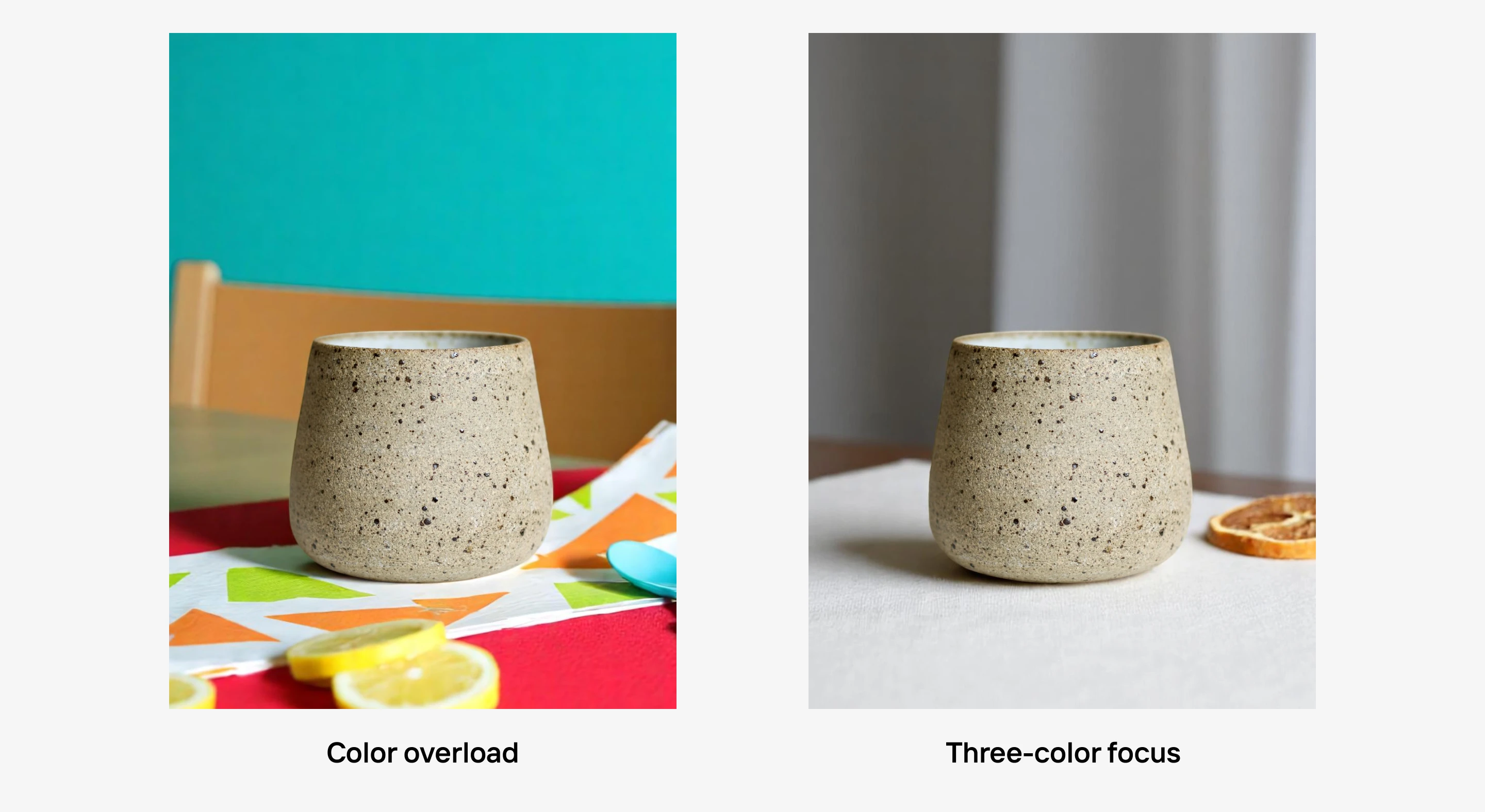
5. Use fewer colors than you think
When you’re working on product photos or digital assets, your instinct might be to make things feel exciting by using lots of colors. But what that usually does is remove people’s attention from your product. A good rule of thumb is to use three main colors: one for your product, one for the background, and one accent color.
Apply color theory for product photos with Photoroom
There’s no doubt about it: product photos rely on how you choose and pair colors. Use these tips to create better-looking images and increase conversions across different sales and marketing channels.
Photoroom makes it so much easier to apply color theory to product photos. It’s designed for businesses and uses AI technology to detect your product’s details and apply the right color principle automatically. Unlock all tools, team collaboration, and a better product photography experience on iOS, Android, or the Web.
FAQs on color wheel theory
What’s the difference between RGB and RYB color systems?
RGB stands for Red, Green, and Blue. It’s used for screens and digital devices like your phone, camera, or computer. RYB stands for Red, Yellow, and Blue, and it’s mostly used in traditional art and painting. For product photos, RGB is the one that matters since your images are viewed on screens.
How do I start using color theory without slowing down my workflow?
The easiest way is to use an AI photo editor like Photoroom. These tools already apply color wheel theory for you. They adjust brightness, balance color, or pick backgrounds that make your product stand out. It saves you from doing all the color matching or editing manually, and still keeps your visuals looking professional.
Why do my photos look different on other people’s devices?
Different screens have different quality, display settings, and built-in color filters. Some screens boost contrast or warmth, while others are more neutral. To keep your photo looking good everywhere, avoid heavy edits and check it on at least one other device before sharing.
What’s the difference between color temperature and white balance?
Color temperature describes the kind of light in your photo. Warm light (like from a lamp) looks more yellow, and cool light (like daylight) looks more blue. White balance is the setting that corrects for that light so your photo looks natural. If the color temperature makes your image too warm or cool, white balance helps fix it so whites look white and colors look right.