The same pattern shows up again and again in Shopify stores: Shopify product pages that look complete but don’t convert as expected.
The layout is in place, the images are uploaded, the details are filled in, and yet something still holds shoppers back. That hesitation usually isn’t about price or persuasion, so what causes it?
A Shopify product page converts when it makes the outcome easy to understand. When someone can clearly see what the product is, which version they’re selecting, what’s included, and how it compares to the rest of the catalog, the decision feels straightforward. When any of that feels slightly unclear, the page asks the shopper to interpret the offer themselves.
This article looks at product page conversion through that lens. It focuses on how product photography shapes expectations before text does, how consistency across a product catalog strengthens each individual Shopify product page, and why reduced uncertainty is what ultimately drives action.
Table of contents
Treat conversion as a confidence outcome, not a persuasion problem
Conversion on a Shopify product page is the result of confidence. People aren’t looking to be convinced; they’re looking to confirm that what they see is accurate, trustworthy, and complete. On a Shopify product page, the most common confidence breaks are simple: uncertainty about what the product actually is (and what’s included), uncertainty about what it costs in total, and uncertainty about what happens if it goes wrong.
When product clarity is working, the page makes one coherent promise across visuals, key details, and policies, so the shopper doesn’t have to interpret, guess, or hunt.
That coherence doesn’t start on the product page alone. It begins in the product listing and the wider catalog. When every product follows the same visual rules, each Shopify product page inherits that consistency.
Product page conversion starts in the catalog
A Shopify product page sits inside a system. It is an output of the catalog structure, not an isolated asset. It’s influenced by the collection page someone just came from and by the visual standards used across the catalog.
When someone moves from a product listing to a product page, they expect continuity. The image they clicked should match what they see. The selected variant should visibly update. Backgrounds, proportions, and framing should feel related. If visuals shift unexpectedly from listing to product page, the page feels less controlled. And when the system feels less controlled, the product itself feels less predictable.
Product page conversion improves when the catalog behaves like one coherent visual system rather than a series of isolated uploads.
Visual clarity sets conversion expectations
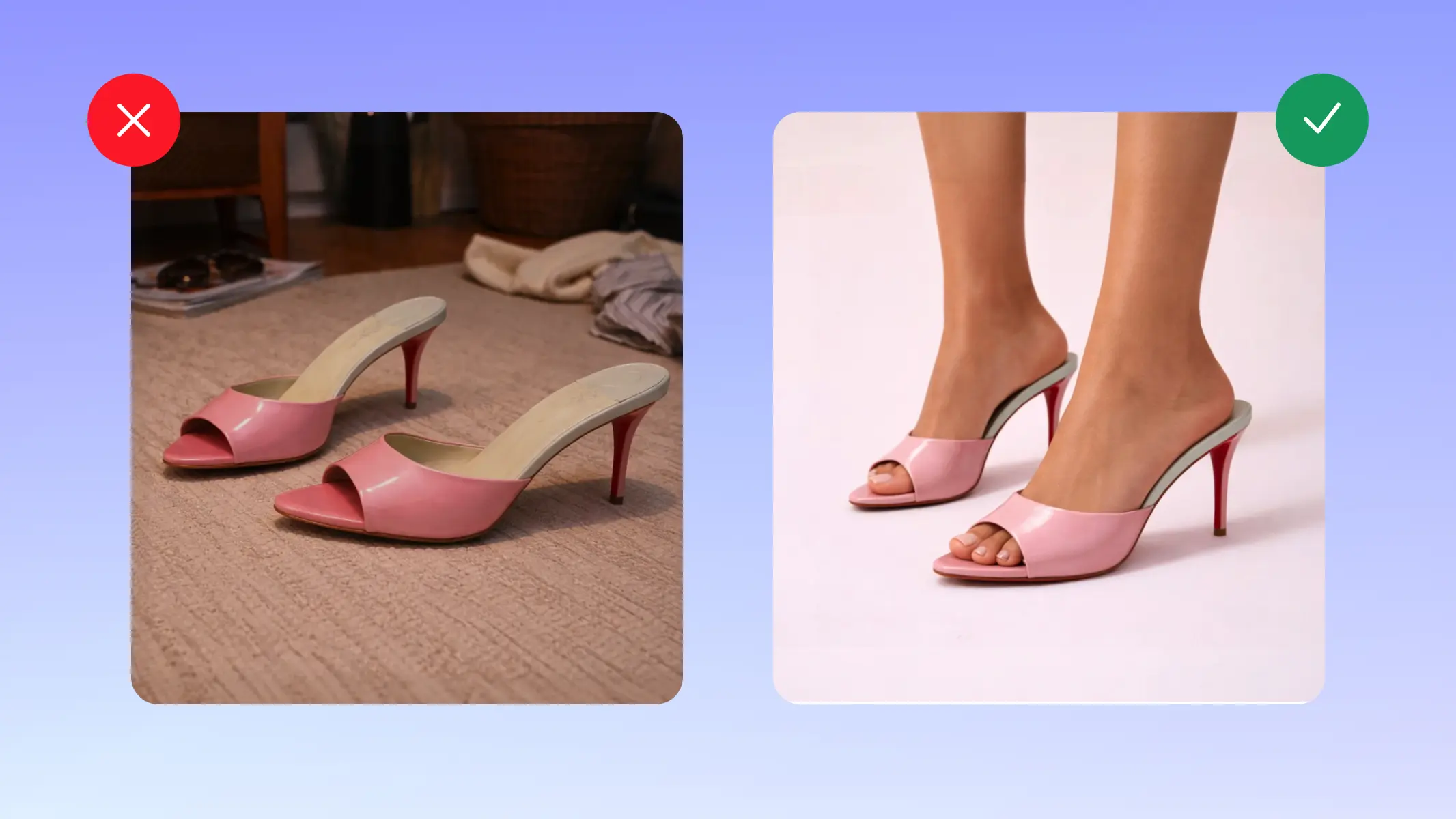
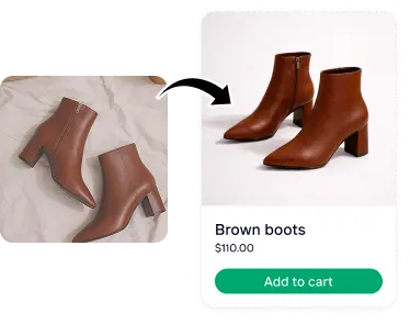
The first product image determines interpretation before any description is read because it defines what the shopper thinks the product is. The goal of the first image isn’t to be artistic; it’s to prevent wrong assumptions immediately, especially about size, finish, quantity, and what’s included.
A strong Shopify product page gallery does two things clearly. It shows the product accurately, and it confirms changes across variants without ambiguity. If a shopper selects a different color, the image updates to reflect that exact option. If quantity or components matter, the gallery makes that visible rather than implied.
When lighting, backgrounds, shadows, and proportions vary across the catalog, the inconsistency becomes part of the experience. Even if each image looks fine on its own, the collection together can look uneven.
Creating consistent product visuals in batches, rather than editing each image individually, helps maintain that alignment as your Shopify store grows.
Alignment across visuals, variants, and price
A Shopify product page works best when visuals, variants, and pricing tell the same story.
If the gallery suggests a set but the price refers to a single item, or if a variant name doesn’t match the image shown, the shopper has to pause and reconcile the difference. That pause introduces doubt. When images clearly represent what’s included, variant selection updates reliably, and the product page reflects the same logic as the catalog listing, the experience feels stable.
Read more: The complete guide to Shopify image sizes
A predictable structure supports visual clarity
A converting product page keeps the decision path stable: identify the product, confirm it’s for me, understand the total offer, then commit without backtracking. Above the fold, the shopper should be able to answer “what it is, who it’s for, and what it costs” at a glance; if they have to scroll to learn basic identity or pricing logic, the page has already created uncertainty.
Predictable structure reduces rereading and comparison fatigue because shoppers know where to find each type of information when they need it. The best structure layers detail without burying it: clear summaries up front, then deeper specifics in the expected places, so the shopper can verify rather than search.
When structure feels uneven, it’s often because visuals and information aren’t aligned. If product images don’t clearly confirm what changes between variants, or if the gallery implies something different from the price and description, shoppers end up assembling the offer themselves. Clear visuals working alongside predictable structure prevent that extra mental work.
When evaluating a Shopify product page, it helps to look at it the way a first-time visitor would. Start with the gallery. What assumptions could someone make based on the first image alone? Then look at variants. Does the visual update clearly confirm what changes and what stays the same? Next, consider price and inclusions. Is the offer visually and structurally aligned, or does the shopper need to reconcile different signals?
Clarity on a product page is cumulative. The gallery, variant logic, pricing, and structure should all reinforce the same promise. When visuals are consistent across the wider product catalog, that clarity becomes predictable. Shoppers begin to recognise the pattern of how products are presented, which makes each new product page easier to understand.
Build a repeatable clarity standard across your product catalog
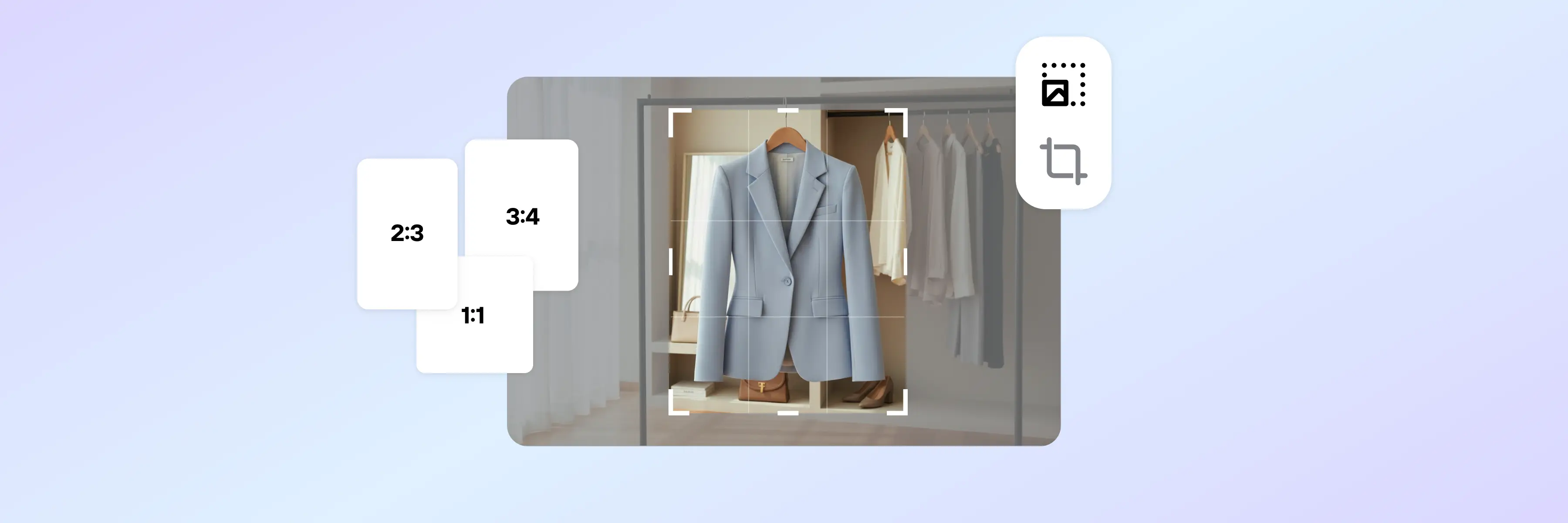
A Shopify product page converts more easily when it sits inside a catalog that looks coherent and predictable. That coherence starts with image consistency: same dimensions, same aspect ratio, stable backgrounds, aligned variant visuals, and file formats that load efficiently without sacrificing detail.
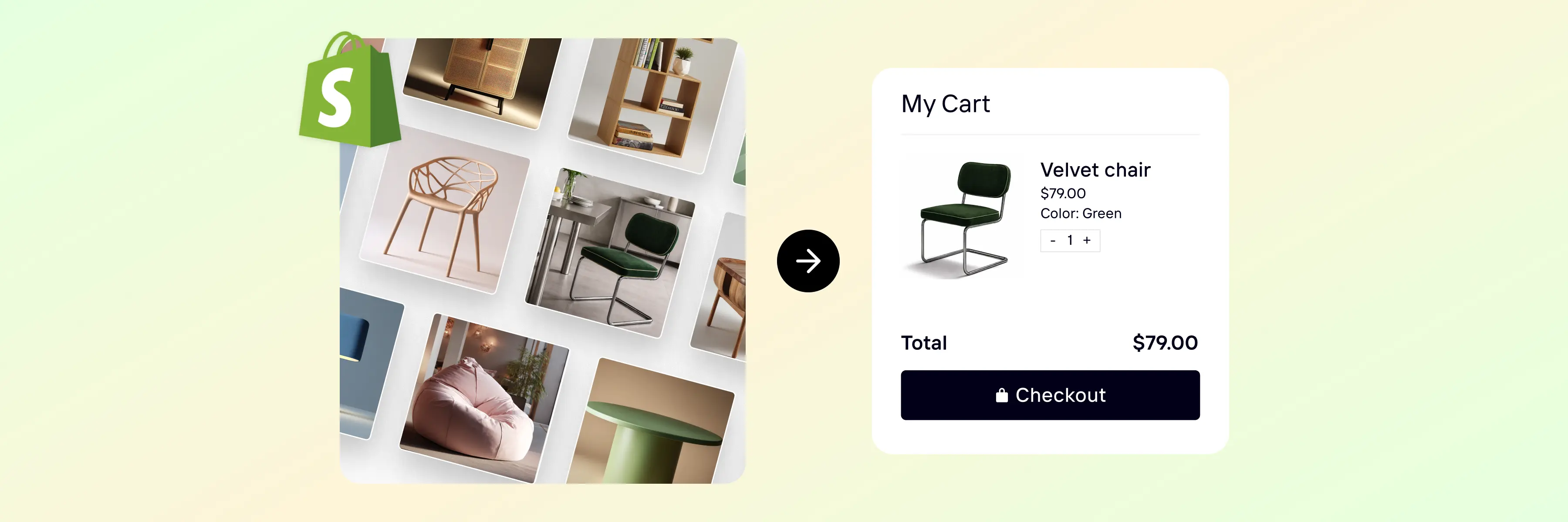
Photoroom helps you standardize your Shopify product images automatically. You can resize images in batches, apply consistent backgrounds, align framing, generate clean variant visuals, and export in modern formats like WebP so your catalog stays sharp and lightweight at the same time.
Instead of fixing images one by one, you define a repeatable visual system that keeps your Shopify product listings clear, comparable, and easy to interpret.
With the Photoroom for Shopify, those visual standards can be applied directly inside your Shopify catalog. That means fewer manual uploads, fewer formatting inconsistencies, and a structured visual layer that supports product clarity at scale.