You launched your Shopify store and everything technically works, but here is the question that really matters: if someone left your site right now, would they remember you?
Shopify makes it straightforward to get a store live with a functional layout. The challenge is that many other brands are using the same themes, the same section layouts, and the same visual patterns. From a potential customer’s point of view, your store can end up looking very similar to several others they’ve just visited. When multiple stores look alike, it becomes much harder for any one of them to stand out.
This article will help you look at your site the way a potential customer does. You will see how standard templates, app based layouts, and generic visuals can quickly make stores blend together. We’ll also cover why standing out when you sell online usually comes down to something more practical: how consistent and recognizable your product images look across your catalog.
Table of contents
The gap between launching a Shopify store and being memorable
Where to start if your Shopify store feels visually inconsistent
The gap between launching a Shopify store and being memorable
There’s a real gap between how you experience your store at launch and how a potential customer experiences it for the first time. You’ve seen every stage of the process, from empty templates to half built pages, so a clean layout and a working checkout feel like major progress. From your side, the store looks finished and ready. From the outside, it looks like one of many stores built on the same foundation.
Potential customers aren’t comparing your site to your draft version or your old website. They’re comparing it to several other stores they’ve visited recently. In that context, a tidy design, a decent logo, and smooth functionality are expected. Those things help you meet the baseline, but they don’t explain why your business is different or why someone should choose you over another option that looks similar.
That’s why a store can have nothing obviously wrong with it and still be easy to forget. If your site doesn’t quickly make clear who your products are for, what makes them specific, and what kind of business is behind them, people move on. So if many stores look fine on the surface but still fail to stand out, the next step is to understand why they end up looking so similar in the first place.
Why Shopify stores often look similar
Shopify’s biggest advantage is speed. You can get a store live quickly, which is great when you want to start selling, but moving fast usually means sticking with the defaults. Most stores end up using the same core structures, from large banner images to product grids, familiar product page layouts, and standard review and trust sections. Even when a store is well put together, it can still feel familiar because customers have seen very similar setups many times before.
Apps add to this pattern. Tools for subscriptions, upsells, sticky add to cart features, popups, icon rows, and FAQs all come with their own built in layouts. Each one solves a real problem, but together they shape the store in predictable ways. Instead of the design reflecting how your business works or what makes your products different, the site starts to reflect the standard toolkit of e‑commerce features.
This explains the visual similarity across many stores. But looking similar is only part of the issue. What really affects whether someone trusts your store is how clearly and consistently your own products are presented once they land on a page.
Why standing out on Shopify is more difficult than it looks
Earlier we talked about how many Shopify stores end up looking similar because they use the same themes and app layouts. That kind of sameness makes it harder to stand out visually.
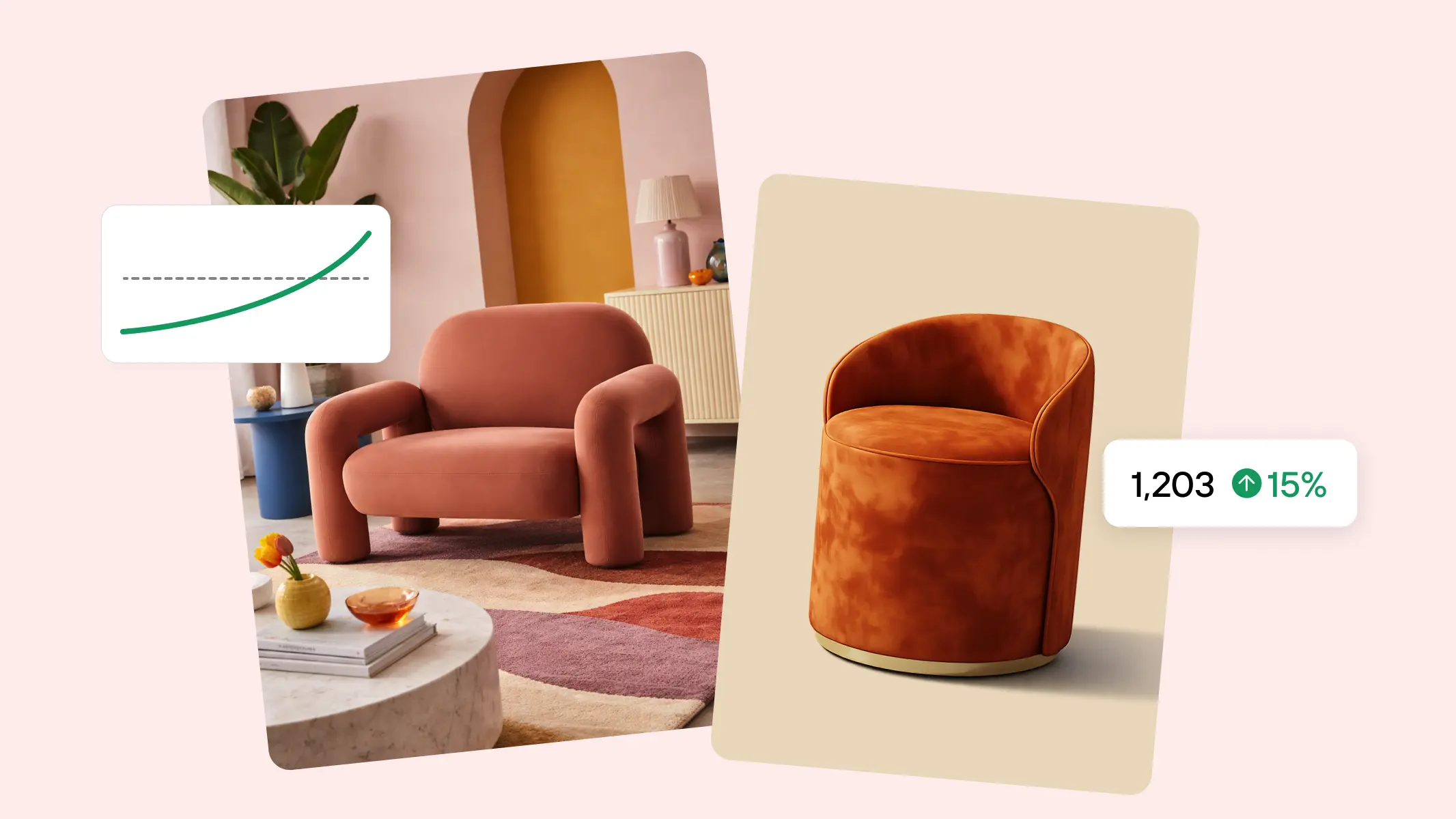
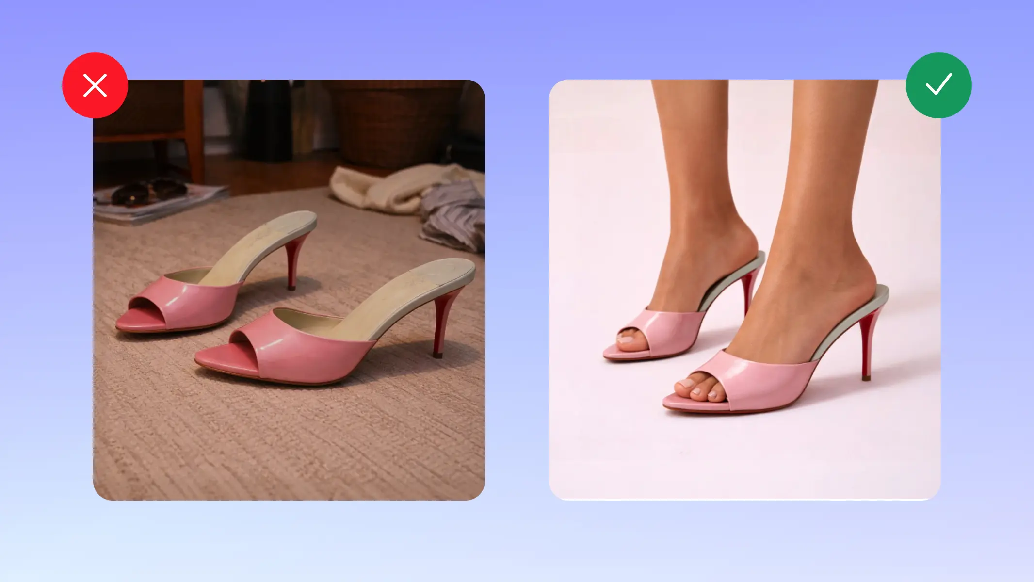
What actually helps a store stand out is visual consistency across the catalog. When product listings on a PLP share the same background style, lighting, framing, and color treatment, the store becomes more recognizable. Instead of each product looking like it came from a different place, the catalog starts to look like one joined up system.
When images follow the same visual rules, it becomes easier to compare items and spot differences. Color variants look intentional instead of random. Products that belong together visually feel grouped together, which makes the catalog easier to scan for potential customers.
The problem is that product listings are often created one at a time, with whatever images happen to be ready. Each page can look fine on its own, but together they feel disconnected. Over time, the store starts to look like a set of separate uploads rather than a catalog built on a clear visual system.
That visual disconnect is one of the main reasons Shopify stores struggle to stand out, even when the products themselves are strong.
On Shopify, once layout and features become standardized, visual consistency across your product catalog becomes the clearest signal of differentiation.
Why visual hierarchy on your Shopify PLP matters
On product listing pages, shoppers aren’t just noticing whether images look consistent. They’re subconsciously deciding where to look first. Visual hierarchy is what guides that order of attention.
If every product image has the same visual weight, the same color intensity, and the same level of detail, nothing stands out as a clear starting point. The page becomes visually flat. Shoppers slow down because they have to decide where to focus, and that pause often means they move on instead of exploring further.
Strong visual hierarchy on a PLP does not mean making some products louder than others. It means making the structure of the catalog obvious. Clear grouping by product type, color family, or style helps shoppers process the page faster. Consistent image scale and positioning ensure that differences between products come from the items themselves, not from unpredictable presentation. When the catalog has a clear visual rhythm, people can scan, compare, and narrow down options without friction.
This kind of hierarchy works alongside consistency. Consistency makes the store look organised. Visual hierarchy makes it easy to understand. Together, they help shoppers move from browsing to choosing without feeling overwhelmed.
Why page by page optimization breaks as your catalog scales
Optimizing product pages one at a time can work when you only have a small range. As your catalog grows, though, small inconsistencies start to pile up. Product names follow different patterns, photo styles vary, and some pages include detailed specs while others skip them. Individually, product pages may look acceptable. As the catalog scales, however, small inconsistencies accumulate and weaken the overall visual system.
This becomes especially visible on product listing pages. When new products are added without shared visual rules, the catalog starts to look uneven. Some images appear brighter than others, backgrounds shift slightly in tone, crops feel tighter on certain items, and color presentation varies from one row to the next. Products that should look related no longer look connected, and shoppers have to work harder to compare options within a category.
This is where sameness and inconsistency collide. Your store still runs on the same templates as many others, but without a unifying visual system, the catalog loses its sense of order. What makes a store feel solid at scale is not one big design move, but a consistent way products are presented across the entire collection. When that system breaks, the store starts to feel harder to scan and understand.
Instead of trying to fix everything at once, it helps to start small and build a pattern you can repeat.
Where to start if your Shopify store feels visually inconsistent
Start small and treat your product listings as a visual system, not a series of uploads. Pick one product line or category and look at it only from the product listing page. Do the images look like they belong together? Are backgrounds consistent, colors balanced, crops similar, and shadows or lighting handled the same way? Your goal at this stage isn’t to rewrite all of your descriptions, but to make the catalog look like it was built with one clear visual standard.
Choose a handful of products and bring their images into alignment. That might mean standardizing background tones, adjusting framing so products sit at similar scales, or making sure color variants are presented in a predictable way. When those few listings look visually connected on the collection grid, you’ve created a pattern you can repeat.
Once that pattern works for one category, you can apply it across the rest of your catalog. Over time, this approach turns a patchwork of individual product images into a cohesive listing system that’s easier to scan, easier to compare, and easier to recognize as your brand.
Make your Shopify product visuals more consistent
Defining visual standards is one step. Maintaining them consistently across dozens or hundreds of listings requires a scalable workflow.
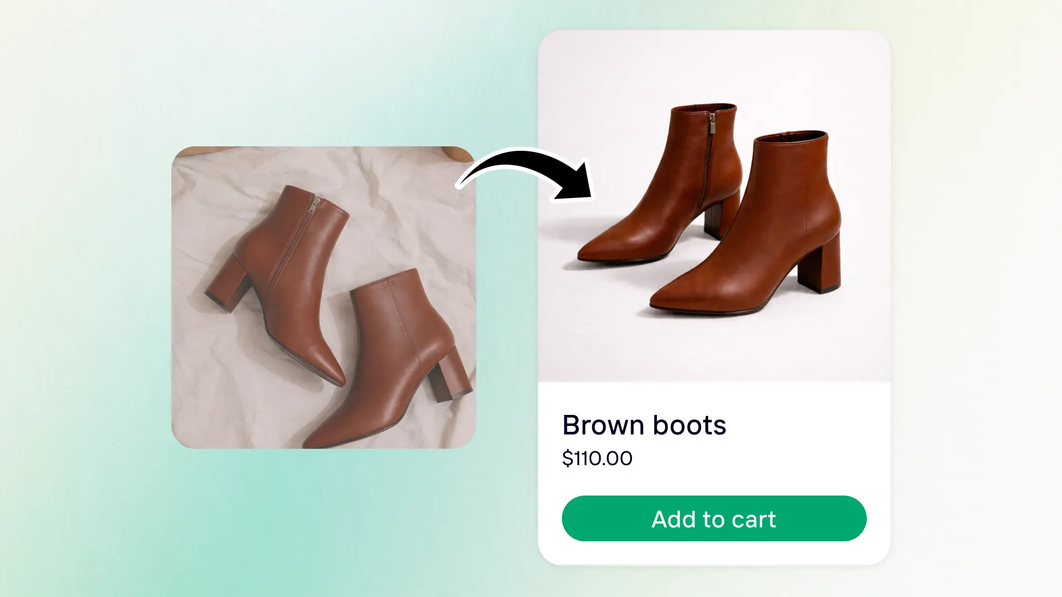
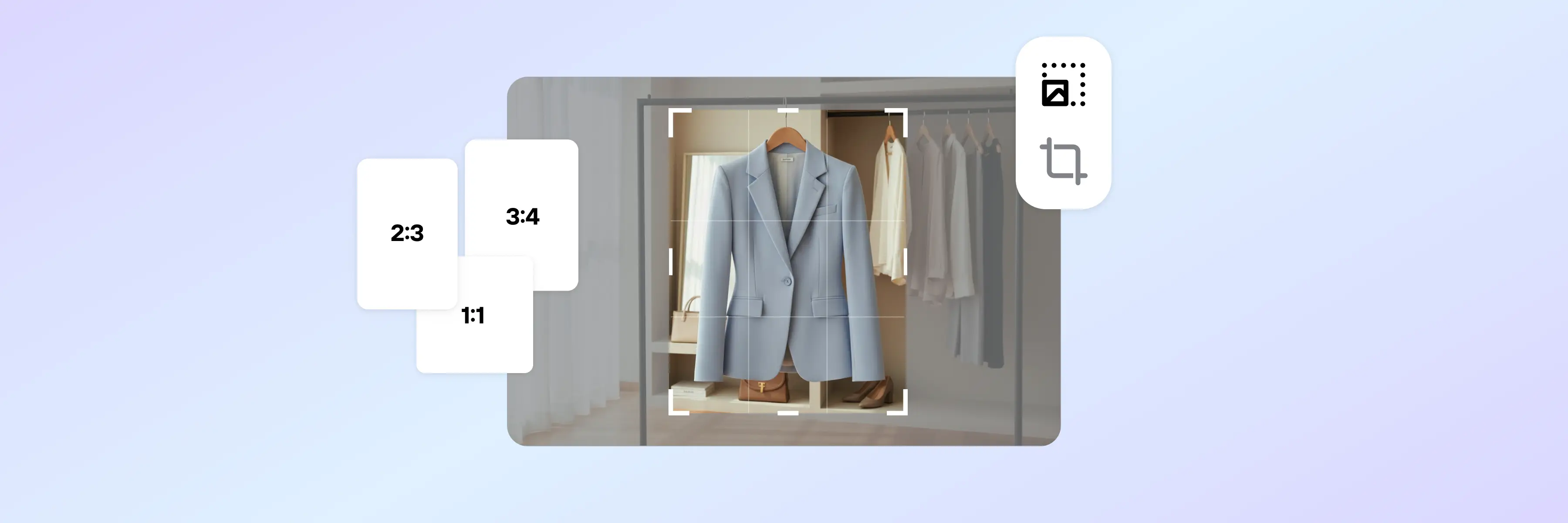
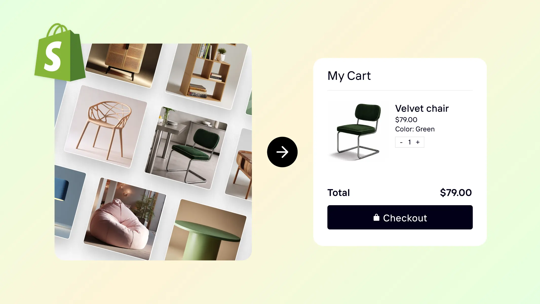
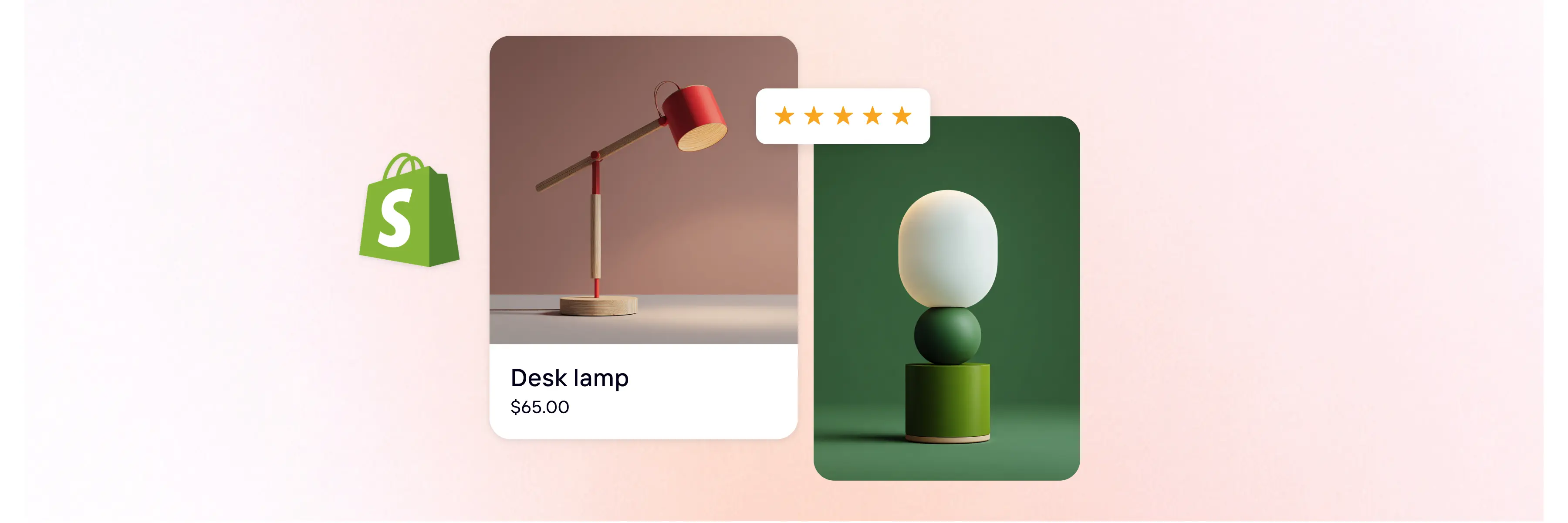
Photoroom helps Shopify merchants standardize product visuals across their entire catalog by aligning aspect ratios, background treatment, and framing at scale.