When someone lands on your Shopify store for the first time, they rarely read your brand story to decide if the store is legitimate. They scan. Within seconds they look for visual consistency, predictable structure, and clear product presentation.
These signals shape whether the store feels real, organised, and trustworthy enough to continue browsing.
Trust at this stage comes from coherence. When the store looks visually stable and products are presented consistently, people assume the business behind it operates with the same reliability. When things look uneven or assembled from different sources, doubt rises before any copy is read.
This article explains how first impressions form, why visual consistency plays a central role in Shopify store trust, and where product presentation often weakens credibility. If you want a deeper breakdown of the technical side of product visuals, see our guides on Shopify product image sizes and common Shopify image mistakes.
Table of contents
Visual signals visitors use to judge Shopify store credibility
How to evaluate your Shopify store like a first-time visitor
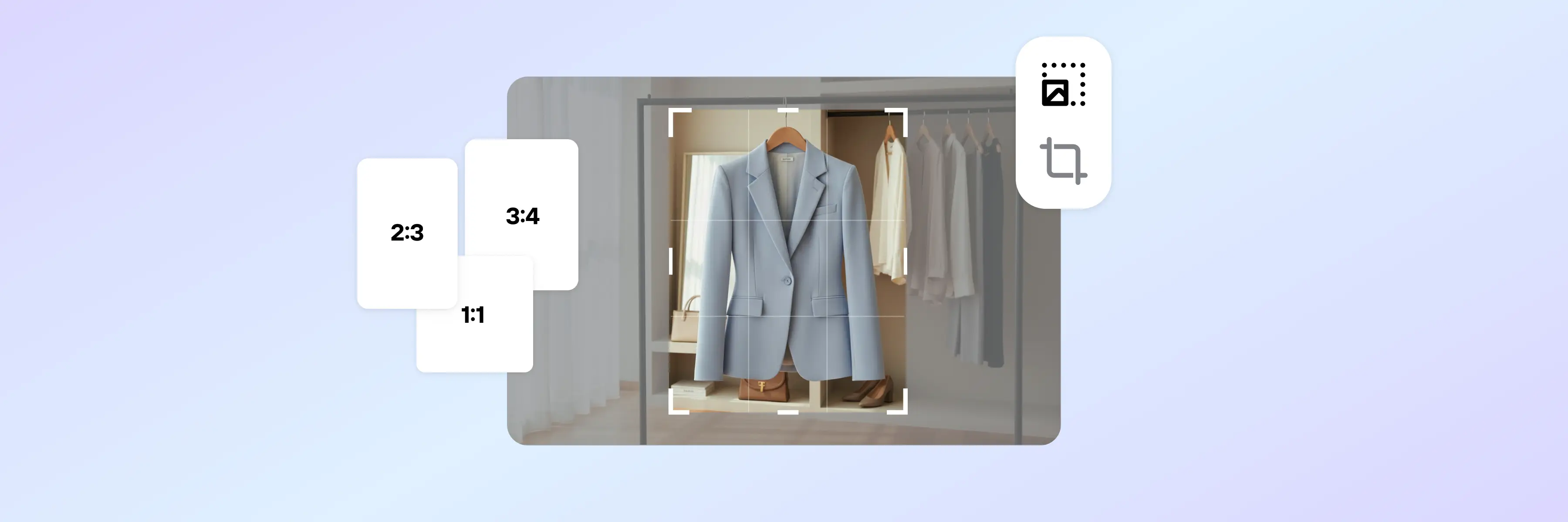
Create consistent product visuals across your Shopify catalog
Quick signals that make a Shopify store look trustworthy
| Signal | What visitors notice | Why it matters |
|---|---|---|
| Consistent product images | Same background, lighting, and framing | Makes the catalog look organised and professional |
| Stable page layouts | Similar spacing and layout behaviour | Reduces confusion and builds credibility |
| Clear product variants | Images match the selected option | Confirms what the customer will receive |
| Predictable navigation | Menus and buttons behave consistently | Makes the store feel maintained |
| Transparent information | Clear pricing, shipping, and stock details | Reduces perceived purchase risk |
How first impressions shape trust in a Shopify store
First-time visitors run a quick credibility check with their eyes before they give a store their attention. They look for signs of order: consistent spacing, stable navigation, predictable layouts, and product images that appear to belong together.
When these signals align, the store feels like a real business.
When they don’t, doubt forms quickly.
Reading comes later. Most people do not examine product descriptions or brand messaging until the visual environment feels coherent. Even strong claims can be overlooked if layouts shift between pages or small details fail to line up.
Inconsistent Shopify store design signals often create hesitation long before someone reaches the information intended to reassure them.
Visual signals visitors use to judge Shopify store credibility
First impressions are shaped by structural consistency across the browsing path.
Visitors quickly scan for:
Alignment between product images across listings
Consistent spacing and layout behaviour between pages
Stable navigation and predictable interface patterns
Clear connection between product variants and visuals
Minimal visual, interaction, or information friction
When these elements follow shared rules across collection pages, product pages, and checkout, the store feels maintained and reliable.
When presentation varies unexpectedly or visual systems break between pages, perceived credibility weakens.
On Shopify, trust is built through system-level coherence rather than decorative branding.
Read also: Why Shopify stores struggle to stand out after launch (and how to fix it)
Why visual consistency increases Shopify store trust
For most shoppers, trust starts with whether everything looks like it belongs together.
A trustworthy Shopify store uses the same visual patterns repeatedly. Spacing follows a similar rhythm. Buttons behave consistently. Product images share a common visual style. Layouts work in the same way from the homepage to collection pages and product pages.
That predictability lowers mental effort, and people often interpret that ease as a signal the business is organised and reliable.
Sudden visual changes are where trust begins to weaken. A different layout on certain product pages, a new style introduced by an app, or spacing that changes from page to page can make the store look like parts from different systems placed next to each other.
Even when the design technically works, visible inconsistencies suggest the experience isn’t being actively maintained.
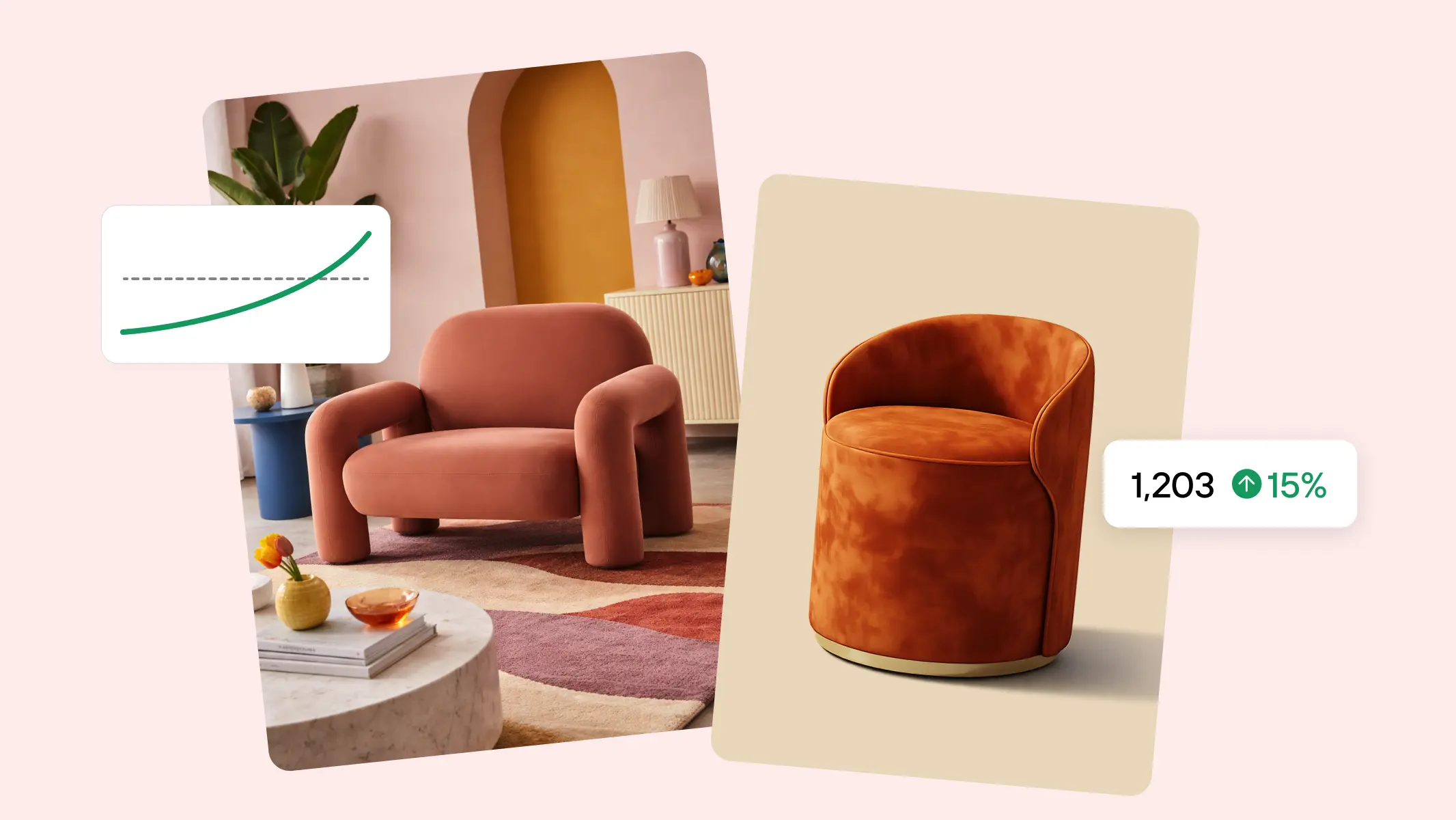
According to Photoroom’s State of GenAI in Marketplaces 2026, 87% of respondents say product visuals are the most important factor in a purchase decision
Product presentation as proof of legitimacy
Product presentation is where Shopify store credibility is most clearly tested.
Shoppers use product images and product information to judge whether the catalog looks organised and consistent.
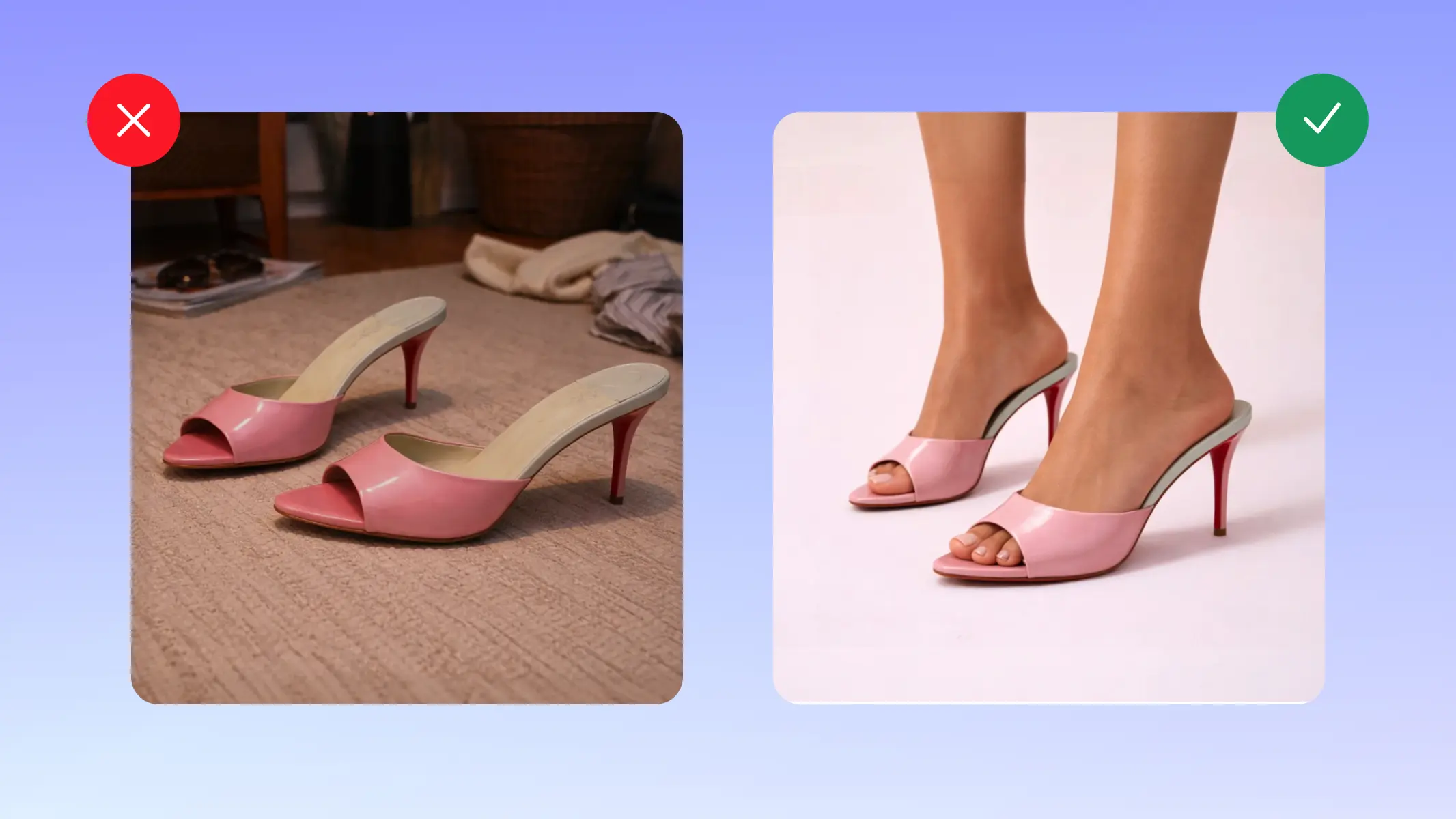
When lighting, angles, cropping, and backgrounds follow the same visual approach, it signals a clear process behind the scenes. When image styles vary widely or aspect ratios jump around on a collection page, the store can look like it is pulling from multiple sources without strong quality control.
Clarity around what is being sold matters just as much.
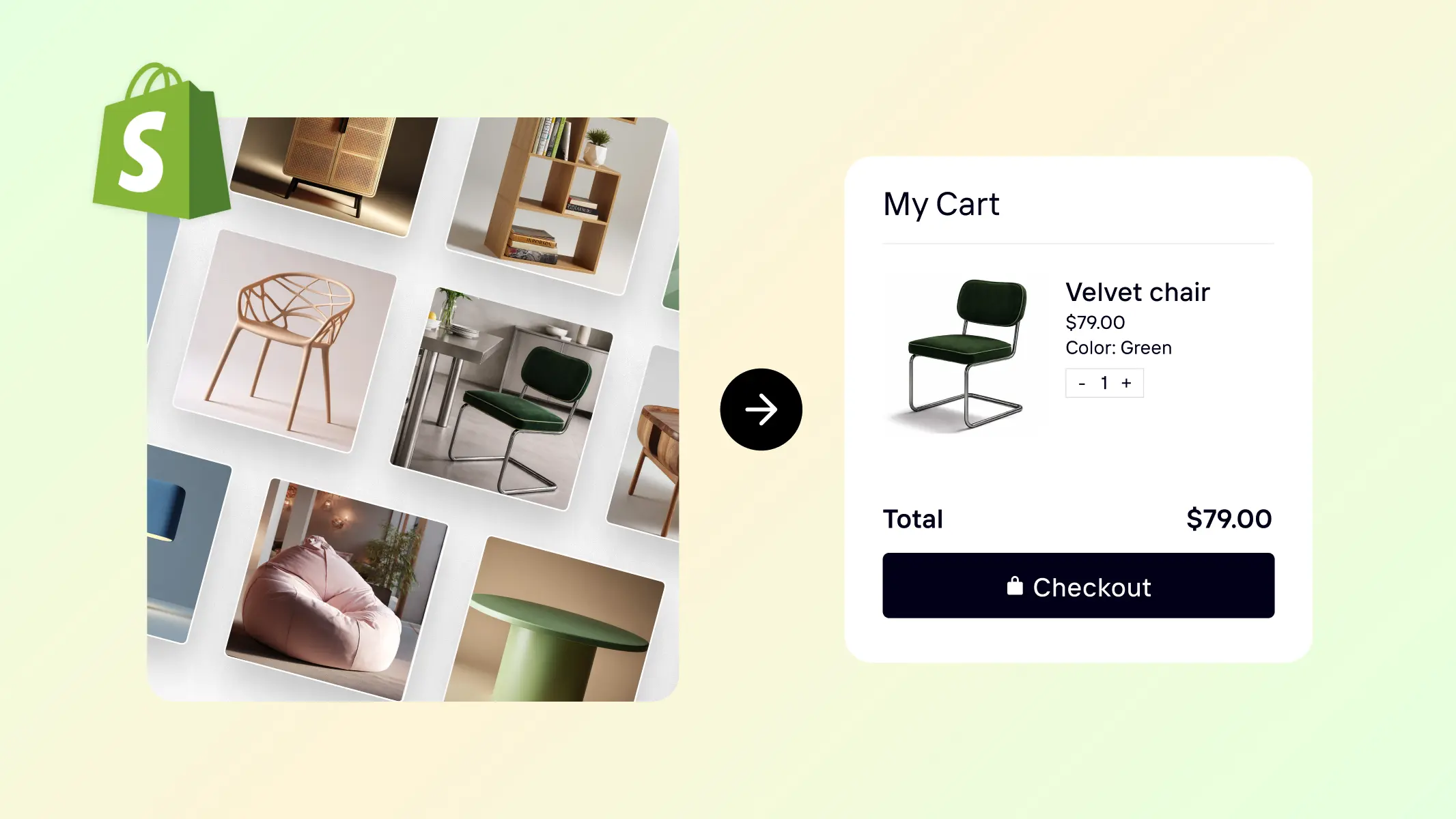
If variant names do not match what appears in photos, swatches do not resemble the product, or the selected option does not clearly match what shows up in the cart, the store begins to feel unreliable.
The same applies to basic information such as materials, dimensions, what is included, and known limitations. When those details are difficult to confirm at a glance, shoppers are left guessing — and guessing increases perceived risk.
Trust increases when what customers see in product images clearly matches what they expect to receive.
How friction reduces trust in a Shopify store
On Shopify, friction is interpreted as a credibility signal.
Layout shifts, inconsistent buttons, or unclear shipping information can reduce perceived legitimacy. Every moment of confusion can be interpreted as a sign the store might be just as unreliable after the purchase.
Visual friction appears when sections look cluttered, components follow different styles, or multiple calls to action compete for attention.
Interaction friction stands out even more. Buttons may behave differently across pages. Layouts might shift as elements load. Popups or drawers may not match the rest of the interface.
Information friction is quieter but equally important. When visitors cannot quickly understand shipping timelines, stock status for their chosen option, or how totals are calculated, uncertainty increases.
At that point, the store can appear rushed or unreliable because it asks for commitment before clearly explaining the product and the process.
Catalog-level consistency across Shopify pages
Trust is not built on a single page. It forms as visitors move through the store.
Most browsing journeys follow a predictable path:
Home page → collection page → product page → cart → checkout.
When each stage follows the same visual and structural rules, the store feels organised and credible.
When different parts of the site appear to follow different systems, the store starts to look pieced together.
Consistency across the product catalog carries more weight than any individual design element. Product imagery, layout structure, and information order all contribute to whether the store looks like a unified business or a mix of disconnected parts.
Read also: Shopify product image size for scalable catalogs
How to evaluate your Shopify store like a first-time visitor
One of the fastest ways to identify trust issues is to review your store from the perspective of someone seeing it for the first time.
Follow the typical browsing path and look for breaks in visual or structural consistency.
Ask yourself:
Do product images follow the same style across collections?
Do layouts behave consistently between pages?
Does spacing remain stable across sections?
Do product variants clearly match the images shown?
Does the browsing experience feel predictable?
Small inconsistencies often create hesitation before visitors consciously identify the problem.
When the experience remains visually and structurally coherent, decisions happen faster. The store feels organised. The brand appears established. The purchase feels safer.
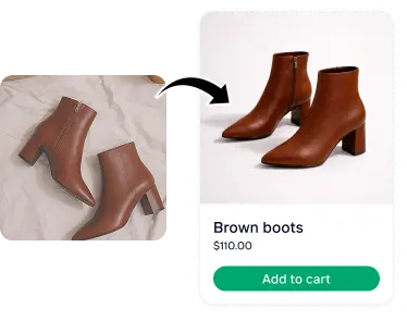
Create consistent product visuals across your Shopify catalog
Product imagery is one of the strongest signals of professionalism in a Shopify store.
When product photos follow the same background, lighting, framing, and styling rules, collection pages and product pages feel aligned. Products become easier to compare, and the catalog appears curated rather than assembled from multiple sources.
Maintaining that level of visual consistency across dozens or hundreds of listings can be difficult when images come from different suppliers or photoshoots.
Photoroom’s AI Listing Assistant help Shopify merchants standardise product visuals at scale by resizing images, aligning framing, and applying consistent backgrounds across entire catalogs. Instead of adjusting listings individually, sellers can apply visual rules across many products at once, helping the store maintain a coherent appearance as the catalog grows.